The main navigation bar at the top of your course website has many design options so it deserves its own tutorial on how to customize it.
You can set colors for the navigation links, customize the sign-in button, upload logos and set other display options. You can also customize the look of the mobile menu that display on devices with small screens (phones, tablets).
To get started, navigate to the Website Editor for your desired course.

Top Navigation Bar
When the Website Editor loads, hover your cursor over the top navigation bar in the preview frame and click the Homepage Navigation button (pointed out in the screenshot below).
Some design options for the top navigation bar can be set independently for the homepage than from the other pages (inner or inside pages) of your website. The rest of the design options are shared across all pages of your site. This is because the header section on the homepage typically has a background image and the navigation bar floats over the top of it (overlays the header content) as shown in the screenshot below. For example, you might want the navbar links on the homepage to be a different color than on the inner pages of your site.

Navbar Options
Expand the Navbar Options panel on the left design menu. The first option in this panel labeled: On-scroll behavior controls whether or not the navbar stays visible at the top of the page when the page is scrolled down.
The setting Sticky: Follows on Scroll means the navbar sticks/stays to the top of the screen and remains visible as you scroll down a long page. The setting Static: Stays at Top means the navbar is fixed at the top of the page and may disappear from view as you scroll down a long page.
For this tutorial we'll assume the option is set to Sticky: Follows on Scroll. Then, if you scroll the preview frame down a little you'll notice the navbar background is no longer transparent and now has a solid background color. You can set a custom background color by changing the Navbar background color after page scrolled setting (as pointed out below).
The rest of the settings on the Navbar options panel are mostly self-explanatory so we'll leave it up to you explore what effect they have. You can hover over the little question mark icon next to a setting to show a tooltip with more info on the setting.

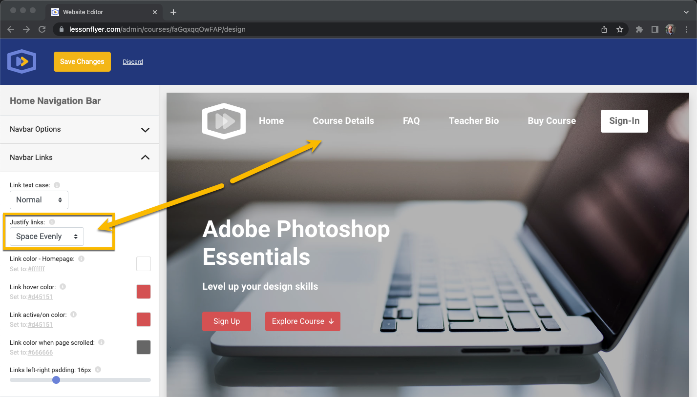
Navbar Links
Next, expand the Navbar Links panel on the left design menu (see screenshot below).
The second option in this panel labeled: Justify Links controls the horizontal alignment of the links in the navigation bar. Try changing this setting to different options to see what effect it has. Tip: If you have a logo in the navbar it looks good when the links are aligned right when the logo is on the left (and vice-versa). If you don't have a logo then the Space Evenly setting looks great. However, it's up to you. Experiment with this setting to see what you like.
Please note: If you're working on a small screen you may need to resize your web browser window until it's wide enough for the preview frame to show the top navigation links. If your browser window is too narrow the preview frame will show the course website's mobile navigation in which case you won't see the links.
The color options on the Navbar Links panel set the navbar link colors for various states such as when a link is hovered, link color when the page is scrolled, etc. Hover over the little question mark icons next to each color option for more details on what each setting controls.
Mobile Options
Next, expand the Mobile Options panel on the left side design menu. After you do that click the Preview Mobile icon on the top bar. See screenshot below for reference. This will switch the website preview frame to mobile mode so you can preview any changes made to the mobile options in this menu panel.
Please note: If you edit a mobile setting such as the color of the mobile menu icon and you're not in mobile preview mode then you might not see the change in the preview frame.

Some of the design settings on the Mobile Options menu panel pertain to when the mobile menu is open vs closed. You can toggle the mobile menu open and closed while experimenting with changes to these design settings. For example, the screenshot below shows the mobile menu when open and the Mobile menu links color (which is currently set to red) controls the color of the links on the opened menu.

Logo
You can upload your logo and add it to the top of every page on your course website.
Hover your cursor over the LessonFlyer placeholder logo at the top of the page in the preview frame of the Website Editor. If you don't see a placeholder logo hover your cusor over the same general area to reveal the Edit Logo button (see screenshot below).

Click the Edit Logo button (pointed out above) to open the Navbar Logo options in the left design menu (see screenshot below).

In this example our navigation bar's On-scroll behavior was set to Sticky: Follow on Scroll. Because of this the Navbar Logo menu (shown above) lets us upload two different versions of our logo. You can upload a Main Logo and an Alternate Logo. This allows you to show one version of your logo on the transparent navigation bar (when the page is not scrolled) and another version of your logo when the navbar has a solid background (when the page has been scrolled). It's optional, you don't have to upload two versions but having the option gives you some design flexiblity. Refer to the screenshot above and notice that the Main logo is set to show when the page is not scrolled and the alternate logo is set to show after the page as been scrolled.
You can also adjust the size and display position (left or right) of your logo.
As we explained at the beginning of this article you can set some navigation bar design options separately for the inner/inside pages of your website (all pages other than the homepage). The homepage settings will carry over to the inner pages but you can override them.
Refer to the screenshot below. If you click to edit the Top Navigation from an inner page (in this case from the Course Details page) you'll see that some settings are labeled with "inner pages" and can be set independently from the homepage.

Sign-In Button
You can also customize the design of the Sign-In button on your website's top navigation bar.
Hover your cursor over the Sign-In button and click Edit to open the Button Options menu. Then customize as desired. See screenshot below for reference.
